Redesigning the Wix "Hire a professional" brief

Team Context
This project was created within the Wix Partners team, which focuses on helping businesses connect with professionals who can support their digital growth journey.
Partners play a critical role in the Wix ecosystem. By helping businesses succeed faster, they contribute to higher customer retention and premium conversion rates. Improving the matching experience therefore had both user and business impact.
Project Overview
How simplifying a complex flow led to a +42.5% increase in conversions.
"Hire a professional" (Automatch Brief) is a core flow in the Wix Marketplace designed to help Wix users find the right professional (Wix Partner) for building or improving their website. Users fill out a brief describing their needs, and are then matched with relevant experts.
The project focused on redesigning the brief experience to reduce friction, simplify decision making, and increase submission rates.
The Problem
Funnel analysis revealed a significant drop throughout the experience, with only 6% of users completing the brief submission process. Through behavioral data analysis and collaboration with data analysts, we identified several factors contributing to abandonment:
Complexity & Cognitive Load:
→ Too many steps (4-step flow) created friction and uncertainty.
→ Overwhelming number of service options (39 total) led to confusion.
→ Users didn’t understand how many steps were ahead of them.
→ The majority of options were rarely selected, adding unnecessary complexity.
Unclear terminology:
→ Terminology was too technical and not aligned with user language.
→ Users struggled to understand which option matched their need.
Here is the old (original) flow:


Main Goals
Business goal - To increase brief submission rates and improve funnel conversion.
UX goal - To simplify the brief experience by reducing steps, minimizing unnecessary choices, and aligning the flow with users’ mental models, ultimately decreasing friction and increasing brief submission rates.
My Role
I led the end to end UX design process, working closely with the product manager to define the strategy and align on business goals.
A key part of my process was collaborating with a data analyst, who provided precise funnel data and user behavior insights. This partnership allowed me to base design decisions on real metrics, identify critical drop points, and validate improvements through measurable impact.
Competitor Research
To better understand how similar platforms handle expert matching flows,
I analyzed products like Fiverr, Upwork, Webflow, Squarespace, and 99designs. Here are the main insights that came up:
- Most competitors use fewer steps and fewer choices.
- Clear progress indication builds trust.
- Some platforms offer users to choose between browsing experts and
submitting a brief.
- Summary screens and guidance improve clarity.
The table below highlights a comparison between main competitors:

The Design process -
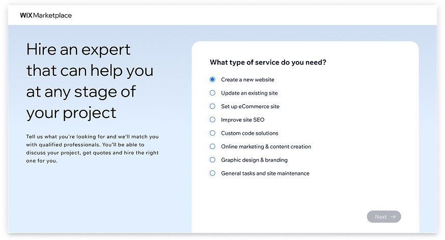
First iteration: Simplifying Choices and Reducing Friction
The UX design process was guided by data driven insights:
Funnel analysis showed a sharp drop from entry to completion (only 6% completion rate). In addition 80% of leads came from only 20% of services.
Based on that, I translated the data into actionable design decisions:
reducing the number of service options from 39 to 8, simplifying the flow from 4 steps to 3 and Updated the terminology to make service options clearer and easier to understand.
Here is the Design:

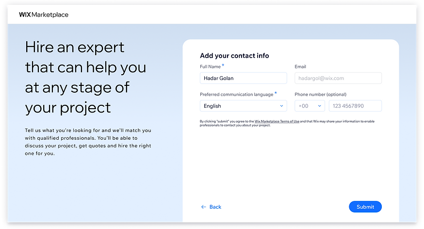
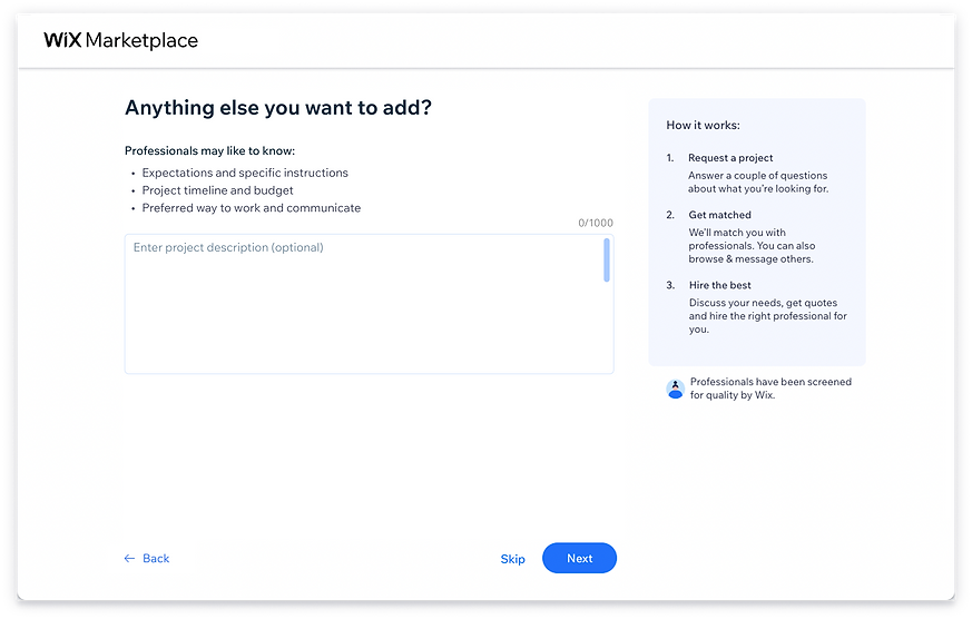
The Design process -
Second iteration:
One Step Experience
The first iteration was validated through an A/B test and resulted in a 9% increase in brief submissions. While this confirmed that reducing steps and limiting choices improved the experience, the outcome still fell below our success criteria.
This led us to realize that the challenge extended beyond the number of services or steps presented to users. The broader issue was the overall complexity of the experience and the cognitive effort required to complete it.
Rather than continuing to optimize the existing structure, we reframed the problem by asking a more fundamental question: What if the brief didn't need multiple steps at all? This shift in perspective led to a new design direction:
→ Transforming the flow into a single-page experience.
→ Reducing decisions to only what is truly essential.
→ Reframing the content using simple, user friendly language.
The goal was to remove not only unnecessary steps, but also uncertainty, and cognitive overload, creating a faster, more intuitive path to completion.
Here is the Design:

Project Impact
The new experience showed a strong positive impact:
→ +42.5% increase in accounts submitting a brief (+570 users).
→ Submission rate increased from 18% → 26% in the tested funnel.
→ Overall marketplace KPI showed a clear uplift in lead generation.
→ Collections increased by ~5%.
Beyond conversion, the simplification also improved the quality of user input by focusing users on the most relevant choices, reducing noise from rarely used services.
The results validated that reducing complexity not only increases completion,
but also creates a more efficient and scalable matching process between users and professionals.